 — the official and only place to purchase Betheme safely and securely.
 Included: 6 months

You can add this item to website in 2 ways:
| Attributes | Description |
|---|---|
Title |
Title of the Progress Bars |
Bars | Title |
Title of the Progress Bars item |
Bars | Value |
Bar value in percent, from 0 to 100 |
Bars | Size |
Bar size in px, default: 20 |
Bars | Color (optional) |
Color of the bar. Use color name, hex or rgba, e.g.: grey, #626262 or rgba(98, 98, 98, 1) |
Bars | Add new |
Add new Progress Bars item |
Content |
Content placed under the Progress bars |
Custom | CSS classes |
Type your own class for the item - this is a useful option for those who want to create a special style. For example: you can type my-class-big-font class and then go to BeTheme options > Custom CSS & JS > Custom CSS and write your own styles for this class: .my-class-big-font { font-size:150% !important; font-weight:bold; }
|
Examples of use:
| Pre-built website: | Link: |
|---|---|
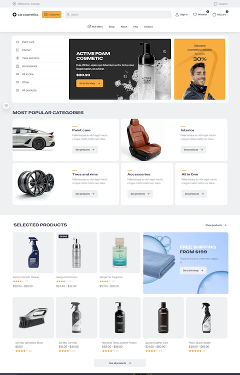
| Internet3 | See in action |
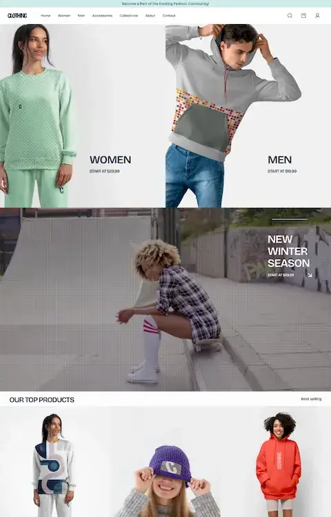
| App7 | See in action |
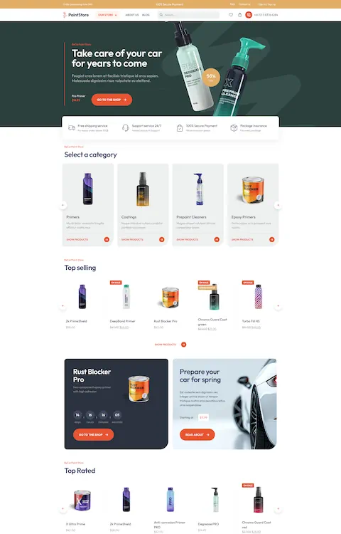
| Consultant | See in action |
| Rallydriver | See in action |
| Swimmingpool | See in action |
| Paintball | See in action |
| Marathon | See in action |
| Mechanic4 | See in action |
| Gunrange | See in action |
| Universe | See in action |
| Hr | See in action |
| Cleaner3 | See in action |
| Internet3 | See in action |
| App7 | See in action |
| Consultant | See in action |
| Rallydriver | See in action |
| Swimmingpool | See in action |
| Paintball | See in action |
| Marathon | See in action |
| Mechanic4 | See in action |
| Gunrange | See in action |
| Universe | See in action |
| Hr | See in action |
| Cleaner3 | See in action |